Groci Organic Food Market Theme
$49.99 Original price was: $49.99.$4.99Current price is: $4.99.
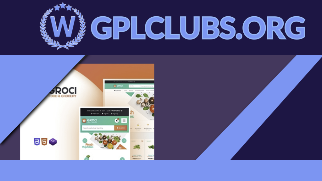
Groci is a ready-to-use, responsive, and innovative organic food WordPress theme that can boost the sales of farming products. The theme allows organic stores to create their own organic food website template and start promoting their agricultural products within days.
Description
Peak is a modern grid based WordPress theme, boasting a masonry tiles layout that can adapt to any screen size or device thrown at it. The tiles layout is auto populated and aligned perfectly in a grid, but you can set your own custom tile size. Equipped with the optional mega menu, various post layouts, slide-out widgets, portfolio, and WooCommerce support, Peak is an excellent multi-purpose theme for blogs, portfolios, magazines, and ecommerce sites.
Responsive
The theme design, including the masonry tiles, is 100% responsive across all modern devices and resolutions. No matter what device you use, the design adapts perfectly to fit in the screen. Try to resize your browser window on the demo to see this in action.
Tiles
The masonry tiles layout offers 2 different layout options: auto tiles and custom tiles. Both are responsive across all devices.
Auto tilesautomatically generates the masonry grid that aligns perfectly no matter how the number of posts that you want to display
Custom tilesoption allows you to set the custom tile size for each category, and the grid layout will automatically adjust based on your selection
Post Layouts
ARCHIVE LAYOUTS
In the archive view, layout options are extremely flexible. You can choose between tiles, list view, or grid layouts in addition to showing the post in an overlay or polaroid style (seesample layoutson one page). It comes with an option for post filters and load more functionality, which allows readers to load more posts without going to the next page.
Portfolio
Showcase your work with the free optional Portfolio post type. The same layout options found in blog post types are available in Portfolio to provide consistency with the layout.
Unique Page Title Banner
Create a unique page title banner for each post, page, category, and even the shop. You can upload any background image and pick any overlay colors.
WooCommerce Support
As a bonus, Peak theme comes with matching styles for WooCommerce, just in case you also wish to sell merchandise.
And more…
Related products
Here is yet another versatile WooCommerce plugin you cannot afford to miss on your WordPress site. Woo Quick View is an interactive product quick view plugin for WooCommerce that grants your site users quick access to main product information with smooth animation. Our quick view plugin is the fastest on the market. The quick view modal loads instantly without never ending loadings!
The code needed to implement your custom fields is conveniently displayed in a Theme Code section right below the Field Group settings in ACF Theme Code.
ChildHope is a modern and functional WordPress Theme for Child Adoption Services and Charities. It is ideal for non-profit organizations, child adoption services, child care, and child protection.
The YOOtheme Pro page builder for WordPress and Joomla is ideal for designers looking to create beautiful page layouts as well as developers who value extensibility and clean, semantic code.
Are you looking for a review plugin for your website that will allow you to build beautiful reviews on your website that are packed with information without any technical or design skills? If yes, then there is no better choice for you to build a full-blown review website with the most incredible support than the WP Review Pro Plugin, which is appreciated by the professionals as one of the most strong review plugin recognized as an all-inclusive solution.
Style your forms with custom CSS themes, field label placeholders, and FontAwesome.
These days, purchasing from one address and shipping to another is commonplace, but purchasing from one address and sending multiple items to various addresses in a single purchase is advantageous.
WP Crowdfunding is a revolutionary WordPress plugin that helps you create a fundraising or backer site with WordPress. This plugin is based on WooCommerce. It has a native wallet system for accepting local payments. WP Crowdfunding has the facility to split the money through Stripe Connect. It‚s a full fledged crowdfunding system.
For items with sensualism and design, Desire Sexy Store is a premium WordPress style. This motif can be made use of for female garments to present the attractive items. Over 300 shortcodes, touch support, mobile-friendly design, sliders, aesthetic author, custom widgets, and much more are included. It is a complete plan for some hot items to be offered by your shop.
WPShapere WordPress Admin Theme is a WordPress plugin to personalize your WordPress administrator, but a muscular unit. It opts totally hoar mark the section of WordPress admin. With WPShapere you bear the potential in conjunction with provide thy customers a full instant admin dashboard with thine company name.
Microthemer is a lightweight yet powerful CSS editor for responsively customizing the appearance of any WordPress theme or plugin content (for example, contact forms).
WordPress Theme for Learning Management System LMSMart Education (LMS). The theme is ideal for e-Learning, Online Courses, Kindergartens, Schools, Colleges, Universities, Training Centers, and Other Institutes.

