
- ×
 Social Auto Poster 1 × $4.99
- ×
 MicroThemer WordPress CSS Editor 1 × $4.99
- × BuddyPress User Badges 1 × $4.99
- × XplodedThemes Woo Quick View 1 × $4.99
- ×
 Beaver Themer 1 × $4.99
- × Packpals - Packaging Company Elementor Template Kit 1 × $4.99
- × FooGallery PRO Expert 1 × $4.99
- × Neve Pro - Business Plan 1 × $4.99
- × iThemes DisplayBuddy Carousel 1 × $4.99
- × Custom Themes For Gravity Forms 1 × $4.99
- × Titan Preloaders and Page Transitions Plugin 1 × $4.99
- × Multiple Addresses for WooCommerce Pro By ThemeHigh 1 × $4.99
- × Advanced Woo Search Pro 1 × $4.99
- × JetThemeCore For Elementor 1 × $4.99
- × Meta Box AIO 1 × $4.99
- × Konstruktic - Construction & Building WordPress Theme 1 × $4.99
- × Download Manager Pro Form Lock Add-on 1 × $4.99
 MicroThemer WordPress CSS Editor
 BuddyPress User Badges
 XplodedThemes Woo Quick View
 Packpals - Packaging Company Elementor Template Kit
 FooGallery PRO Expert
 Neve Pro - Business Plan
 iThemes DisplayBuddy Carousel
 Custom Themes For Gravity Forms
 Titan Preloaders and Page Transitions Plugin
 Multiple Addresses for WooCommerce Pro By ThemeHigh
 Advanced Woo Search Pro
 JetThemeCore For Elementor
 Meta Box AIO
 Download Manager Pro Form Lock Add-on
98%
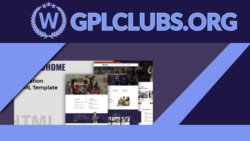
Eduhome – Education HTML Template
Original price was: $49.99.$4.99Current price is: $4.99.
An powerful HTML5 concept template is the Eduhome- Education HTML Theme. Create everything you want in Corporate, Industry, School, Firm, Sports, Publication, Wedding Event, Portfolio, Blog Site, Charity, University, Non-profit organization, Freelancer or Return to this theme that looks easily on-point just whatever is possible with Mist. You can create something outstanding with all its characteristics. With lots of great decisions and roles, it is ultimately flexible.
Version: latest
Last Update: September 8, 2021
Product PageDescription
Tisa is the latest addition to our responsive theme collection. What is responsive? Responsive means the design is adaptive to the browser’s viewport. The layout is completely fluid. No matter what device and resolution that your visitor is using, the theme automatically resizes and flow with the viewport. It works on most desktop browsers (Chrome, Firefox, Safari, IE, etc.) and mobile devices such as iPhone, iPad, Blackberry, and Android. To see this in action, view the demo and resize the browser window. If you like responsive layout, you may also like: Elemin, Funki, Minblr, Wumblr, and iTheme2.
Features
Fluid & Responsive layout (works on desktop and mobile devices such as iPhone, iPad, Android, Blackberry, etc.)
Feature slider
Lightbox gallery (no plugins required)
Product or service highlights
Welcome message
Optional RSS, search form, and social network icons
Header and footer custom menu
Footer text and footer logo
List view and multiple grid view layouts
Choose up to 4 footer widget columns
6 theme skins
Coded with HTML5 & CSS3
Child theme support
Related products
98%

Original price was: $49.99.$4.99Current price is: $4.99.
WP Crowdfunding is a revolutionary WordPress plugin that helps you create a fundraising or backer site with WordPress. This plugin is based on WooCommerce. It has a native wallet system for accepting local payments. WP Crowdfunding has the facility to split the money through Stripe Connect. It‚s a full fledged crowdfunding system.
98%

Original price was: $49.99.$4.99Current price is: $4.99.
The MainWP iThemes Security Extension combines the functionality of your MainWP Dashboard with the well-known iThemes Security Plugin (over 600,000 Active Installs). The iThemes Security Extension allows you to manage the iThemes Security settings for all of your child sites from the MainWP Dashboard.
98%

Original price was: $49.99.$4.99Current price is: $4.99.
WordPress Theme for Learning Management System LMSMart Education (LMS). The theme is ideal for e-Learning, Online Courses, Kindergartens, Schools, Colleges, Universities, Training Centers, and Other Institutes.
98%

Original price was: $49.99.$4.99Current price is: $4.99.
Clever Widgets - WordPress Plugin Transforms Your Website from Dumb to Clever in Just a Few Clicks
98%

Original price was: $49.99.$4.99Current price is: $4.99.
Take the Creator of Beaver much further. Beaver Themer allows you to create archive page templates, model an entire post type, 404 and search pages, and create components such as headers and footers. Field links allow you to link the layouts to the data within each template form.
98%

Original price was: $49.99.$4.99Current price is: $4.99.
When using our feed to post feature, filter which posts you want to include. Include or remove keyword-based posts and monitor how many things are imported from the feed.
98%

Original price was: $49.99.$4.99Current price is: $4.99.
Konstruktic is a WordPress Theme for Competent & Responsive Building & Building that is suitable for all business fields, including construction, engineering and architecture, such as the construction industry, businesses & factories, architectural firms, construction companies. A perfect theme for architects, contractors and consultants in building.
98%

Original price was: $49.99.$4.99Current price is: $4.99.
Heroic KB allows you to quickly construct a beautifully designed, searchable knowledge base.
98%

Original price was: $49.99.$4.99Current price is: $4.99.
Rumah - Construction Elementor Theme Template Kit Rumah includes 17+ pre-built templates that are fully responsive, have a clean design, and can be customized. Rumah is a business theme created specifically for construction companies and those who provide building services. If you want a high-quality designed theme with more extra features for your business, Rumah is the best option for you to launch your website quickly.
98%

Original price was: $49.99.$4.99Current price is: $4.99.
ChildHope is a modern and functional WordPress Theme for Child Adoption Services and Charities. It is ideal for non-profit organizations, child adoption services, child care, and child protection.
98%

Original price was: $49.99.$4.99Current price is: $4.99.
Redia is an Elegant Wedding Theme Elementor Template Kit. Redia is a fully responsive, clean, and customizable theme that comes with a Wedding theme and a Porftolio collection.
98%

Original price was: $49.99.$4.99Current price is: $4.99.
Slideshow creates image slideshows that can be added to widget areas or to posts and pages via shortcodes. Use existing media library images or upload new images to groups and customize Slideshow modes with animation, transition and navigation options.